
Favorite paint colors in my house

all photos by Emily Bolt
Eileen here… I’ve been quiet on the blog front the past year but I’ve been super active over on instagram (@eileenandco_) so head over there if you want to be updated on some of latest projects, which have been a LOT. I have a lot of people ask me about paint colors and I thought I would share on a more permanent home my favorites that show up in my house.

In my kitchen, I used Sherwin Williams Iron Ore. Its a perfect *not quite black, not quite charcoal grey, has a lot of warmth* color. Our tile in the kitchen has a color that on first glance you would think is black but when you hold true black next to it you realize its not. Iron Ore is a great choice when you don’t want stark black, its easier on your eyes. My bestie Lindsay painted her exterior Iron Ore recently and its amazing! (check it here)

Another color I get asked a lot about is the bookshelves in Wren’s room. They are cushing green by benjamin moore and its the PERFECT muddy green with blue undertones. Its muddy without being dull and it works perfectly with all the black and white in her room. Its also my front door color!

I can’t talk about my favorite paint colors without talking about the star of my past two houses, sea pearl by Ben Moore. 75% of my house now and our previous house was painted this color. It’s a perfect… how to describe it? White but not stark. Cream but not yellow. Warm but not grey. It balances well in bright spaces and spaces that don’t get as much light. Wren’s walls below are seapearl, and the upper cabinets and walls in the kitchen are sea pearl as well.

Below is Sea Pearl in our living room- walls, ceiling and trim all the same color.

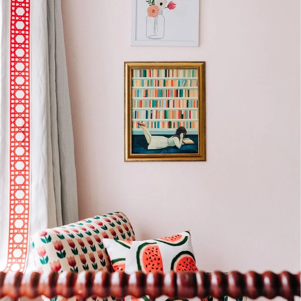
One I don’t talk a lot about but it’s a good one is the PERFECT peachy pink. Pink is a notoriously hard color to pick, it can look totally fine on the chip but pepto bismal in the room veryyyy quickly. I’ve found a lot of times its good to cut a color by 50% pigment to tone it down, and this color was no exception. I used ‘peach nectar’ by ben moore at 50% and LOVE it. Perfect peach without blinding you.

I wanted tonal warm look in our bedroom without going stark. The trim was already painted white dove by ben moore by the previous owner and I picked grey mist by ben moore for the walls. Its warm without being a ‘color’ and plays so beautifully with the white dove floors and trim.

I’ll be back soon on the blog sharing our new bathroom remodel and addition! Emily Bolt (who took all these amazing pictures) is coming soon to shoot the new spaces and I can’t wait to share!